AppBar
一个Material Design设计的App标题栏
AppBar由工具栏和其他一些小组件组成,比如TabBar和flexibleSpaceBar。AppBar通常使用IconButton来显示一个或者多个常用操作,这些操作后面可选地跟一个PopupMenuButton用于不太常见的操作(通常称为"溢出菜单")。
AppBar通常用于Scaffold.appBar属性,该属性将AppBar作为固定高度的组件放置于屏幕顶部。如果想要可以滚动的AppBar可以参考SliverAppBar,它将AppBar嵌入到了Sliver中,以便在CustomScrollView中使用。
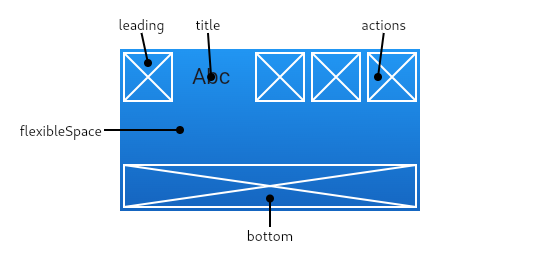
AppBar在底部(bottom)上方显示其他的一些组件,如标题、按钮操作等。底部通常用于TabBar的使用。如果指定了flexibleSpace小组件,则它将堆叠(在Z轴方向上)在工具栏和底部小组件的下面。
如果没有设置leading组件,但是AppBar位于带有Drawer的Scaffold中,则会自动在leading处添加一个按钮来打开抽屉。如果没有的话,Navigator有任何先前的路由,则会在leading中插入BackButton按钮。可以通过automaticallyImplyLeading来关闭此行为。设置为false的时候,中间的组件会向前扩展到空出来的leading位置。
正常情况下,
AppBar会根据环境MediaQuery的padding来嵌入其内容,以避免干扰系统UI。当使用Scaffold.appBar属性时,Scaffold会处理此问题。在为AppBar制作动画时,可能会出现意外MediaQuery的变化(在Hero动画中很常见)可能会导致内容突然跳动。将AppBar包裹在MediaQuery小组件中,并调整其填充,使动画流畅。
构造函数
AppBar.new({
    Key? key,
    Widget? leading,
    bool automaticallyImplyLeading = true,
    Widget? title,
    List<Widget>? actions,
    Widget? flexibleSpace,
    PreferredSizeWidget? bottom,
    double? elevation,
    double? scrolledUnderElevation,
    ScrollNotificationPredicate notificationPredicate = defaultScrollNotificationPredicate,
    Color? shadowColor,
    Color? surfaceTintColor,
    ShapeBorder? shape,
    Color? backgroundColor,
    Color? foregroundColor,
    IconThemeData? iconTheme,
    IconThemeData? actionsIconTheme,
    bool primary = true,
    bool? centerTitle,
    bool excludeHeaderSemantics = false,
    double? titleSpacing,
    double toolbarOpacity = 1.0,
    double bottomOpacity = 1.0,
    double? toolbarHeight,
    double? leadingWidth,
    TextStyle? toolbarTextStyle,
    TextStyle? titleTextStyle,
    SystemUiOverlayStyle? systemOverlayStyle,
    bool forceMaterialTransparency = false,
    bool useDefaultSemanticsOrder = true,
    Clip? clipBehavior,
    EdgeInsetsGeometry? actionsPadding,
    bool animateColor = false
})
参数
| 参数名 | 参数类型 | 解释 |
|---|---|---|
| actions | List<Widget>? | 在标题后面展示的一个小组件列表 |
| actionsIconTheme | IconThemeData? | 针对AppBar中的actions设置对应的图标主题信息,包含图标颜色、不透明度和大小等信息 |
| actionsPadding | EdgeInsetsGeometry? | actions和AppBar末端的间距 |
| animateColor | bool | 针对颜色变化是否进行动画 | |
| automaticllyImplyLeading | bool | 如果leading组件为空时,是否自动添加对应的备选按钮 |
| backgroundColor | Color? | 背景填充色 |
| bottom | PreferredSizeWidget? | 出现在AppBar底部的小组件 |
| bottomOpacity | double | 设置AppBar底部区域的不透明度 |
| centerTitle | bool? | 标题是否居中 |
| clipBehavior | Clip? | 根据该选项的内容决定是否对AppBar内容进行裁切 |
| elevation | double? | AppBar相对于父组件的z坐标(即垂直于屏幕的高度) |
| flexibleSpace | Widget? | 该组件堆叠在tool bar和tab bar后面(即z坐标比这两者更低)。其高度与AppBar的整体高度相同 |
| forceMaterialTransparency | bool | 强制将AppBar的Material小组件类型设置为MaterialType.transparency(而不是Material的默认类型) |
| foregroundColor | Color? | AppBar中文本和图标的默认颜色 |
| iconTheme | IconThemeData? | 工具栏图标使用的颜色、不透明度和大小 |
| leading | Widget? | 在工具栏标题前显示的小组件 |
| leadingWidth | double? | 设置AppBar.leading小组件的宽度 |
| notificationPredicate | ScrollNotificationPredicate | |
| preferredSize | Size | 工具栏高度与底部小组件高度之和 |
| primary | bool | 设置AppBar是否应该显示在屏幕顶部 |
| runtimeType | Type | 对象运行时类型的表示 |
| scrolledUnderElevation | double? | 如果AppBar下方有滚动内容,则将使用该z轴高度 |
| shadowColor | Color? | AppBar下方阴影的颜色 |
| shape | ShapeBorder? | AppBar材质和阴影的形状 |
| surfaceTintColor | Color? | 应用在AppBar背景色上表面着色层颜色,这样可以凸显出高度 |
| systemOverlayStyle | SystemUiOverlayStyle? | 使用指定的样式来设置在系统Overlay上,比如Android或iOS上的状态栏、Android上的系统导航栏 |
| title | Widget? | AppBar中标题使用的Widget |
| titleSpacing | double? | 标题内容在水平轴上的间距。即使没有leading和actions,也会使用此间距。如果想要标题占用所有可用空间,将此值设置为0.0 |
| titleTextStyle | TextStyle? | AppBar标题小组件所使用的样式 |
| toolbarHeight | double? | 设置AppBar工具栏组件的高度 |
| toolbarOpacity | double | 设置AppBar工具栏组件的不透明度 |
| toolbarTextStyle | TextStyle? | 设置AppBar的文本样式(包含leading和actions,但是不包含标题) |
静态方法
perferredHeightFor(BuildContext context, Size preferredSize) -> double
Scaffold用它来计算AppBar的整体高度。返回值与preferredSize.height相同。除非AppBar.toolbarHeight为null且AppBarTheme.of(context).toolbarHeight非空,在这种情况下,返回值是AppBar工具栏高度和AppBar.bottom组件高度之和。