NavigationBar
底部导航栏组件,用于在应用的不同页面间快速切换
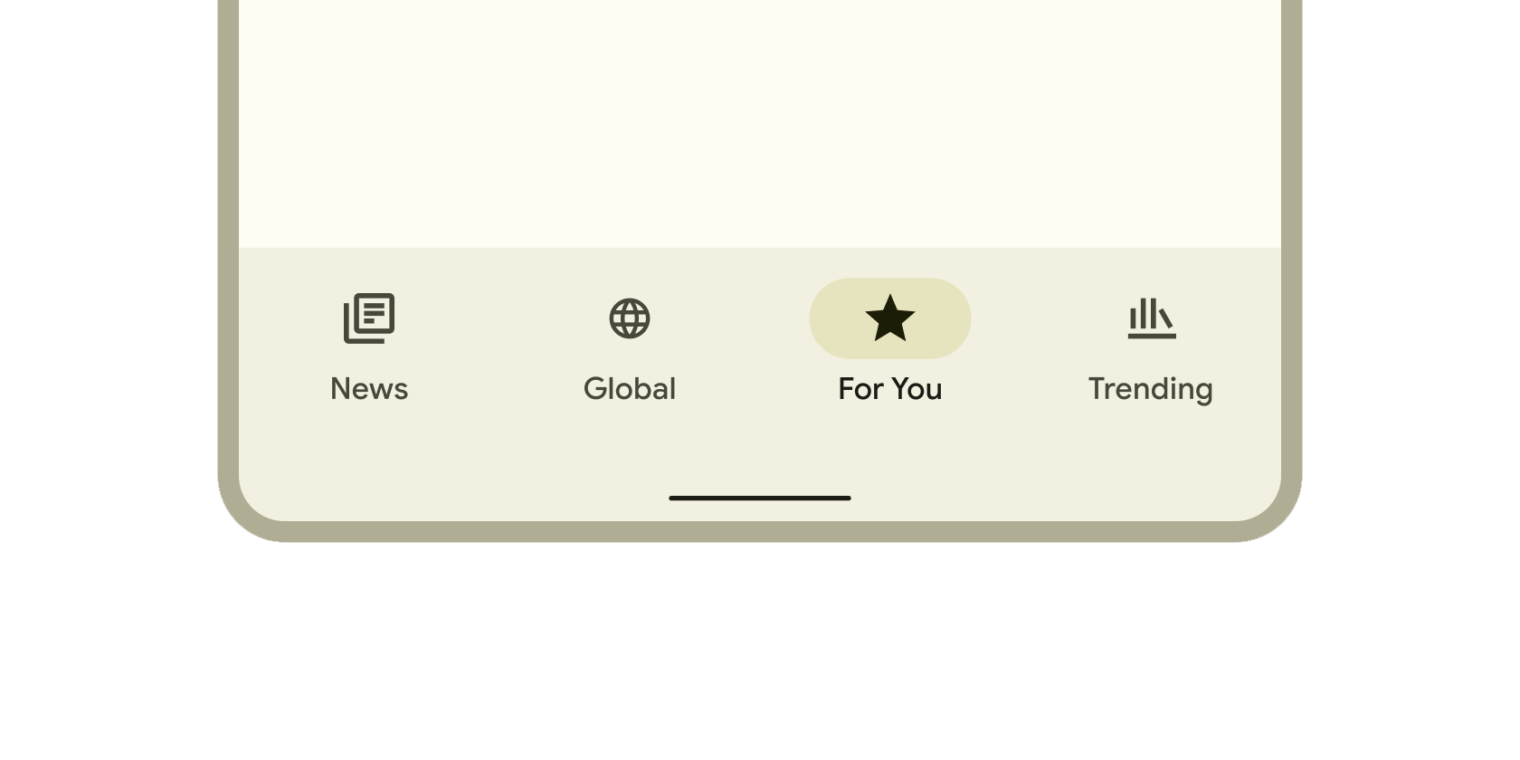
NavigationBar是Flutter提供的底部导航栏组件,用于在应用的不同页面间快速切换。它采用Material Design 3风格,支持图标、标签和主题适配,常用于构建移动端
的主导航结构。其核心逻辑是通过selectedIndex属性管理当前选中项,并触发onDestinationSelected回调实现页面跳转。
使用场景
- 主界面底部导航(如社交应用的首页、消息、个人中心切换)。
- 数据看板的分类切换(如统计页面的日、周、月视图)。
- 需要适配深色/浅色主题的导航界面。
示例
基础底部导航
int currentIndex = 0; // 默认选中首页

NavigationBar(
  selectedIndex: currentIndex,
  onDestinationSelected: (index) => setState(() => currentIndex = index),
  destinations: const [
    NavigationDestination(icon: Icon(Icons.home), label: '首页'),
    NavigationDestination(icon: Icon(Icons.business), label: '业务'),
    NavigationDestination(icon: Icon(Icons.school), label: '学习'),
  ],
)
带主题适配的导航
// 在 ThemeData 中自定义导航样式
NavigationBar(
  backgroundColor: Theme.of(context).colorScheme.surfaceVariant,
  indicatorColor: Colors.blue.shade100,
  destinations: [
    NavigationDestination(
      icon: Icon(Icons.nightlight, color: Colors.grey),
      selectedIcon: Icon(Icons.nightlight, color: Colors.blue),
      label: '夜间模式',
    ),
    NavigationDestination(icon: Icon(Icons.settings), label: '设置'),
  ],
)
动态响应交互状态
bool isNotificationActive = true;

NavigationBar(
  onDestinationSelected: (index) {
    if (index == 1) setState(() => isNotificationActive = false); // 点击后清除通知状态
  },
  destinations: [
    NavigationDestination(icon: Icon(Icons.chat), label: '聊天'),
    NavigationDestination(
      icon: Badge(
        isLabelVisible: isNotificationActive,
        child: Icon(Icons.notifications),
      ),
      label: '通知',
    ),
  ],
)
注意点
常见问题
- 性能瓶颈: 频繁调用
setState更新selectedIndex可能导致页面重绘,建议与PageView结合时使用PageController减少重建。 - 兼容性警告:
NavigationBar要求Flutter 2.0+且需启用Material 3主题(useMaterial3: true)。
优化技巧
- 使用
const修饰静态的destinations列表以减少运行时开销。 - 通过
indicatorShape属性自定义选中指示器形状(如圆形、矩形圆角)。
最佳实践
- 导航项数量建议控制在3-5个,避免过度拥挤。
- 优先使用官方
Material Icons确保视觉一致性。
构造函数
const NavigationBar({
  Key? key,
  required this.destinations,           // 导航项列表
  this.selectedIndex = 0,              // 当前选中索引
  this.onDestinationSelected,          // 点击回调函数
  this.backgroundColor,                // 背景色
  this.indicatorColor,                 // 选中指示器颜色
  this.indicatorShape,                 // 指示器形状
  this.height,                         // 导航栏高度
  this.animationDuration,              // 切换动画时长
})
属性
| 属性名 | 属性类型 | 说明 |
|---|---|---|
destinations | List<NavigationDestination> | 必需,定义导航项列表(图标+标签)。 |
selectedIndex | int | 当前选中的导航项索引,默认为 0。 |
onDestinationSelected | ValueChanged<int>? | 点击导航项时的回调函数,参数为被点击项的索引。 |
backgroundColor | Color? | 导航栏背景颜色,若为 null 则使用主题默认色。 |
indicatorColor | Color? | 选中项底部指示器的颜色。 |
indicatorShape | ShapeBorder? | 指示器的形状(如 CircleBorder() 或 RoundedRectangleBorder())。 |
height | double? | 自定义导航栏高度,默认根据平台自适应。 |
animationDuration | Duration? | 导航项切换的动画时长,默认为 200ms。 |
关键属性详解
destinations: 每个NavigationDestination需包含icon和label,支持selectedIcon定义选中状态的自定义图标。indicatorColor: 与背景色对比度需大于4.5:1以确保无障碍访问性。onDestinationSelected: 回调中必须更新selectedIndex并触发界面刷新(如调用setState)。