SegmentedButton
Material Design风格的分段按钮组件
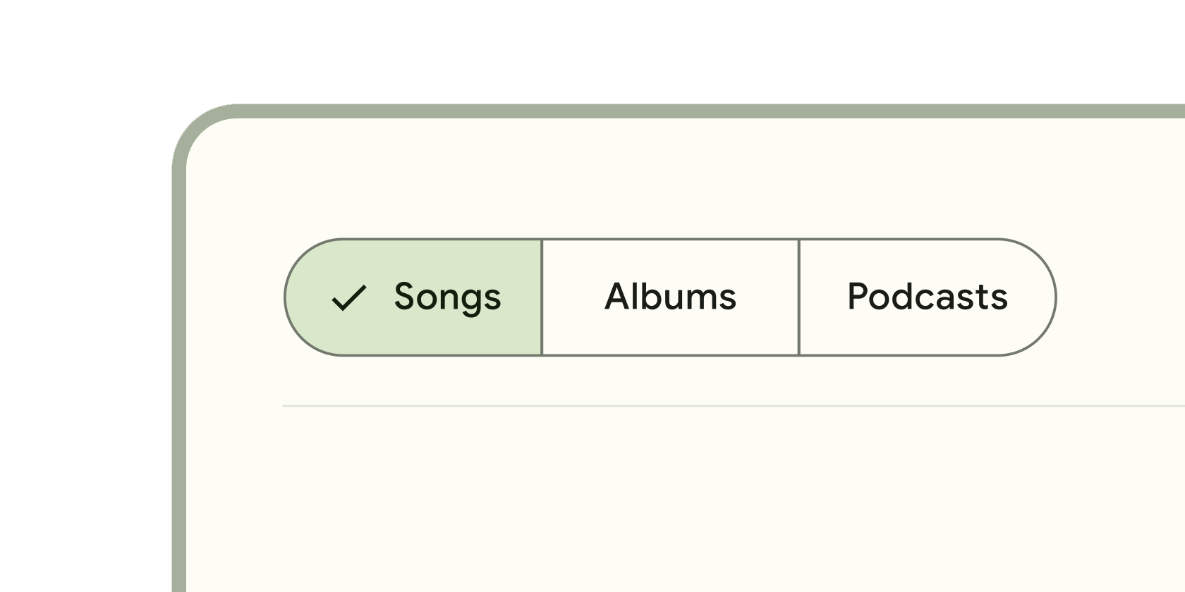
SegmentedButton是Flutter中的一个Material Design风格的分段按钮组件,用于在一组互斥的选项中进行选择。它通过水平排列的按钮段呈现选项,用户每次只能选择一个或多个(取决于配置)选项。该组件基于ToggleButtons实现,但提供了
更符合Material Design规范的样式和交互逻辑,适用于设置切换、筛选操作或分类选择等场景。
使用场景
- 设置选择: 如切换应用主题(亮色/暗色)、语言选项。
- 数据筛选: 如表格数据按状态筛选(全部/进行中/已完成)。
- 分类切换: 如商品列表按类别显示(热门/新品/折扣)。
示例
基础单选分段按钮
import 'package:flutter/material.dart';
class BasicSegmentedButtonExample extends StatefulWidget {
const BasicSegmentedButtonExample({super.key});
State<BasicSegmentedButtonExample> createState() => _BasicSegmentedButtonExampleState();
}
class _BasicSegmentedButtonExampleState extends State<BasicSegmentedButtonExample> {
// 定义选项值
final List<Widget> _options = const [
Text('选项A'),
Text('选项B'),
Text('选项C'),
];
// 跟踪当前选中项(单选模式下为单个值)
int _selectedIndex = 0;
Widget build(BuildContext context) {
return SegmentedButton<int>(
segments: <ButtonSegment<int>>[
// 生成三个按钮段,每个段对应一个索引
for (int i = 0; i < _options.length; i++)
ButtonSegment<int>(
value: i,
label: _options[i],
),
],
selected: {_selectedIndex}, // 传入当前选中项的集合
onSelectionChanged: (Set<int> newSelection) {
setState(() {
_selectedIndex = newSelection.first; // 更新选中状态
});
},
);
}
}
多选分段按钮
class MultiSelectSegmentedButtonExample extends StatefulWidget {
const MultiSelectSegmentedButtonExample({super.key});
State<MultiSelectSegmentedButtonExample> createState() => _MultiSelectSegmentedButtonExampleState();
}
class _MultiSelectSegmentedButtonExampleState extends State<MultiSelectSegmentedButtonExample> {
// 多选模式下,使用集合存储所有选中项
Set<String> _selectedOptions = {'A'};
Widget build(BuildContext context) {
return SegmentedButton<String>(
// 配置多选模式
multiSelectionEnabled: true,
segments: const <ButtonSegment<String>>[
ButtonSegment<String>(
value: 'A',
label: Text('功能A'),
icon: Icon(Icons.star),
),
ButtonSegment<String>(
value: 'B',
label: Text('功能B'),
icon: Icon(Icons.favorite),
),
ButtonSegment<String>(
value: 'C',
label: Text('功能C'),
icon: Icon(Icons.public),
),
],
selected: _selectedOptions,
onSelectionChanged: (Set<String> newSelection) {
setState(() {
_selectedOptions = newSelection;
});
},
// 适配主题样式
style: SegmentedButton.styleFrom(
foregroundColor: Theme.of(context).colorScheme.onPrimaryContainer,
backgroundColor: Theme.of(context).colorScheme.primaryContainer,
),
);
}
}
带禁用状态和自定义样式的分段按钮
class CustomSegmentedButtonExample extends StatefulWidget {
const CustomSegmentedButtonExample({super.key});
State<CustomSegmentedButtonExample> createState() => _CustomSegmentedButtonExampleState();
}
class _CustomSegmentedButtonExampleState extends State<CustomSegmentedButtonExample> {
Set<FilterOption> _selectedFilters = {FilterOption.pending};
Widget build(BuildContext context) {
return SegmentedButton<FilterOption>(
segments: const <ButtonSegment<FilterOption>>[
ButtonSegment<FilterOption>(
value: FilterOption.all,
label: Text('全部'),
enabled: false, // 禁用该选项
tooltip: '暂不可用', // 禁用时显示提示
),
ButtonSegment<FilterOption>(
value: FilterOption.pending,
label: Text('待处理'),
),
ButtonSegment<FilterOption>(
value: FilterOption.completed,
label: Text('已完成'),
),
],
selected: _selectedFilters,
onSelectionChanged: (Set<FilterOption> newSelection) {
setState(() {
_selectedFilters = newSelection;
});
},
// 完全自定义样式
style: SegmentedButton.styleFrom(
side: BorderSide(color: Colors.grey.shade300),
shape: RoundedRectangleBorder(borderRadius: BorderRadius.circular(8)),
padding: const EdgeInsets.symmetric(vertical: 12, horizontal: 16),
),
);
}
}
// 枚举类型定义选项
enum FilterOption { all, pending, completed }
注意点
常见问题与优化技巧
- 性能瓶颈
- 避免在
onSelectionChanged中执行耗时操作(如网络请求),否则会阻塞UI响应。建议使用debounce或异步处理。 - 若选项数量过多(如超过10个),考虑使用
Wrap或自定义滚动容器替代,避免布局溢出。
- 兼容性警告
- Flutter版本:
SegmentedButton要求Flutter3.10.0或更高版本(因依赖ToggleButtons的更新)。低版本需手动检查兼容性。 - 平台差异: 在
iOS上可能需通过styleFrom调整边框圆角以符合设计规范。
- 最佳实践
- 标签简洁性: 按钮标签应简短(如1-2个词),过长文本会导致布局混乱。
- 默认选中: 始终设置初始选中项(如
selected: {0}),避免未选中状态误导用户。 - 无障碍支持: 为每个
ButtonSegment添加tooltip属性,辅助屏幕阅读器识别功能。
构造函数
SegmentedButton<T>({
  Key? key,
  required List<ButtonSegment<T>> segments,        // 必选:按钮段配置列表
  required Set<T> selected,                       // 必选:当前选中值的集合
  required void Function(Set<T>) onSelectionChanged, // 必选:选中变更回调
  bool multiSelectionEnabled = false,             // 可选:是否启用多选(默认false)
  bool emptySelectionAllowed = false,             // 可选:是否允许空选(默认false)
  SegmentedButtonStyle? style,                    // 可选:整体样式配置
})
属性
| 属性名 | 属性类型 | 说明 |
|---|---|---|
segments | List<ButtonSegment<T>> | 按钮段配置列表,每个段包含值、标签、图标等。 |
selected | Set<T> | 当前选中的值集合。 |
onSelectionChanged | void Function(Set<T>) | 选中状态变化时的回调函数。 |
multiSelectionEnabled | bool | 是否启用多选模式(默认false)。 |
emptySelectionAllowed | bool | 是否允许空选(默认false)。 |
style | SegmentedButtonStyle? | 通过 SegmentedButton.styleFrom 统一设置按钮样式。 |
关键属性详解
selected属性
- 作用: 控制组件的选中状态,必须与
onSelectionChanged联动更新。 - 注意: 集合中的值必须与
segments中某段的value一致,否则会导致未定义行为。
multiSelectionEnabled属性
- 性能影响: 多选模式下,选中项较多时可能引发渲染开销,建议对大量选项做虚拟化处理。
- 交互设计: 启用多选时,需在UI中明确提示用户(如标签添加“(可多选)”)。
style属性
- 推荐用法: 使用
SegmentedButton.styleFrom工厂方法创建样式,确保主题一致性。 - 自定义扩展: 可通过继承
SegmentedButtonStyle完全自定义边框、内边距等。