AppBar
用于构建应用顶部导航栏的核心组件
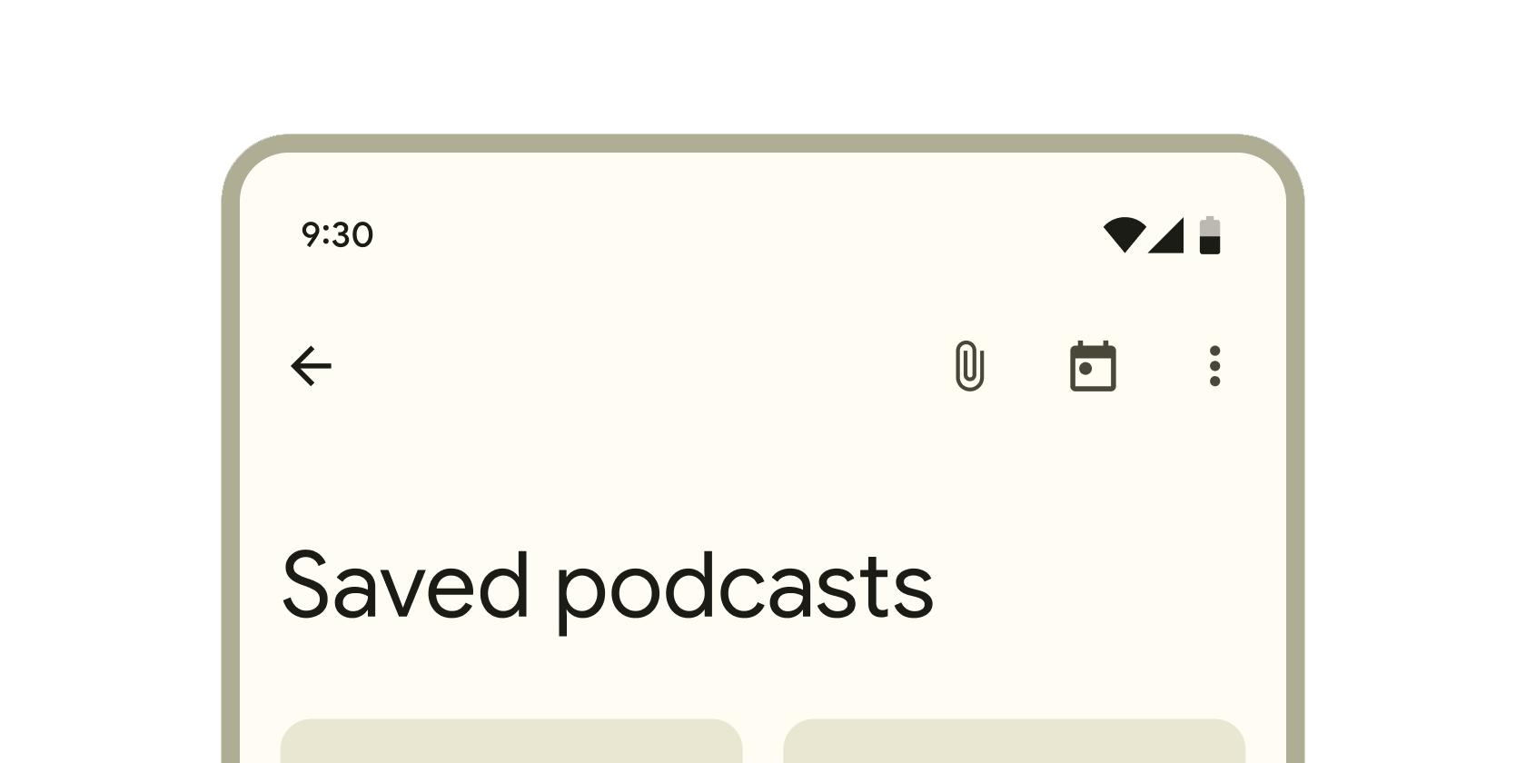
AppBar是Flutter中用于构建应用顶部导航栏的核心组件,通常包含标题、操作按钮、返回箭头等元素。它基于Material Design规范,自动适配主题颜色和阴影效果,并支持与Scaffold组件无缝集成。
使用场景
- 作为页面的标题栏,显示当前页面名称。
- 提供导航功能(如返回按钮)。
- 放置菜单按钮、搜索图标等用户操作入口。
- 实现透明导航栏或自定义背景效果。
示例
基础AppBar
Scaffold(
  appBar: AppBar(
    title: Text('首页'),
    automaticallyImplyLeading: true, // 自动根据路由添加返回按钮
  ),
  body: Center(child: Text('页面内容')),
);
带操作按钮和图标主题的AppBar
AppBar(
  title: Text('设置'),
  actions: [
    IconButton(icon: Icon(Icons.search), onPressed: () {}),
    PopupMenuButton(
      itemBuilder: (context) => [
        PopupMenuItem(child: Text('选项1')),
        PopupMenuItem(child: Text('选项2')),
      ],
    ),
  ],
  iconTheme: IconThemeData(color: Colors.white), // 自定义图标颜色
);
自定义背景和透明效果
AppBar(
  title: Text('个人中心'),
  backgroundColor: Colors.transparent, // 透明背景
  elevation: 0, // 移除阴影
  flexibleSpace: Container(
    decoration: BoxDecoration(
      gradient: LinearGradient(colors: [Colors.blue, Colors.purple]),
    ),
  ),
);
注意点
常见问题与优化
- 性能陷阱: 避免在
actions中直接创建大量复杂组件,建议使用const构造函数或提取到独立变量。 - 兼容性警告: 在iOS中,
AppBar的样式可能需通过CupertinoNavigationBar适配以符合平台规范。 - 最佳实践:
- 优先使用
Scaffold.appBar属性而非嵌套AppBar,避免布局冲突。 - 通过
toolbarHeight调整高度时,需同步测试小屏幕设备的显示效果。 - 深色主题下需手动设置
iconTheme和textTheme确保可读性。
- 优先使用
构造函数
AppBar({
  Key? key,
  this.leading,           // 左侧组件(如返回按钮)
  this.automaticallyImplyLeading = true, // 是否自动生成 leading
  this.title,             // 标题组件
  this.actions,           // 右侧操作按钮列表
  this.flexibleSpace,     // 可折叠背景组件
  this.bottom,            // 底部组件(如 TabBar)
  this.elevation,         // 阴影高度
  this.scrolledUnderElevation, // 滚动时阴影高度
  this.shadowColor,       // 阴影颜色
  this.surfaceTintColor,  // 表面色调颜色
  this.shape,             // 形状装饰
  this.backgroundColor,   // 背景颜色
  this.foregroundColor,   // 前景颜色
  this.iconTheme,         // 图标主题
  this.actionsIconTheme,  // 操作按钮图标主题
  this.primary = true,    // 是否显示在状态栏下方
  this.centerTitle,       // 标题是否居中
  this.excludeHeaderSemantics = false,
  this.titleSpacing,      // 标题间距
  this.toolbarHeight = kToolbarHeight, // 工具栏高度
  this.leadingWidth,      // leading 组件宽度
  this.toolbarTextStyle,  // 工具栏文本样式
  this.titleTextStyle,    // 标题文本样式
  this.systemOverlayStyle, // 系统叠层样式
})
属性
| 属性名 | 类型 | 说明 |
|---|---|---|
title | Widget? | 标题组件,通常为 Text |
leading | Widget? | 左侧组件(如自定义返回按钮) |
actions | List<Widget>? | 右侧操作按钮列表 |
backgroundColor | Color? | 背景颜色,默认使用主题的 primaryColor |
elevation | double? | 阴影高度,影响视觉层次感 |
flexibleSpace | Widget? | 可伸缩背景组件(用于渐变或图片背景) |
bottom | PreferredSizeWidget? | 底部组件(常与 TabBar 结合使用) |
toolbarHeight | double? | 工具栏高度,默认值为 kToolbarHeight(56.0) |
centerTitle | bool? | 标题是否居中(默认为 Android 居左、iOS 居中) |
关键属性详解:
actions: 需注意按钮数量过多时可能溢出,建议使用PopupMenuButton收纳次要操作。flexibleSpace: 该组件会伸展到整个AppBar区域,但不会被标题或按钮覆盖,适合实现动态背景效果。bottom: 与TabBar联用时需确保TabController正确初始化,否则可能引发状态错误。