CupertinoSwitch
Flutter中Cupertino设计语言包提供的一个开关按钮组件,它模仿了iOS风格的开关
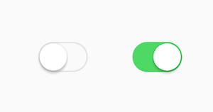
CupertinoSwitch是Flutter中Cupertino设计语言包提供的一个开关按钮组件,它模仿了iOS风格的开关。这个组件允许用户在两个状态(开/关,或true/false)之间进行切换,通常用于设置中启用或禁用某个功能。它的主要特点是
简洁的视觉设计和流畅的动画效果,完美契合iOS平台的用户体验。
使用场景
- 设置界面: 在应用的设置页面中,用于控制各种功能的开启与关闭,例如“接收通知”、“深色模式”、“自动播放”等。
- 表单: 在注册或配置表单中,提供快速切换选项。
- 自定义列表项: 在列表中作为某个功能的快速开关,提升用户交互效率。
示例
基本用法
import 'package:flutter/cupertino.dart';
import 'package:flutter/material.dart'; // 引入MaterialDesign,仅用于Scaffold
class BasicCupertinoSwitchExample extends StatefulWidget {
const BasicCupertinoSwitchExample({Key? key}) : super(key: key);
State<BasicCupertinoSwitchExample> createState() => _BasicCupertinoSwitchExampleState();
}
class _BasicCupertinoSwitchExampleState extends State<BasicCupertinoSwitchExample> {
bool _lights = false; // 控制开关状态的布尔变量
Widget build(BuildContext context) {
return CupertinoPageScaffold( // Cupertino风格的页面
navigationBar: const CupertinoNavigationBar(
middle: Text('基础开关示例'),
),
child: Center(
child: Column(
mainAxisAlignment: MainAxisAlignment.center,
children: <Widget>[
Text('灯光已${_lights ? '开启' : '关闭'}', style: const TextStyle(fontSize: 20)),
const SizedBox(height: 20),
CupertinoSwitch(
value: _lights, // 当前开关状态
onChanged: (bool value) { // 当开关状态改变时调用
setState(() {
_lights = value; // 更新状态
});
},
),
],
),
),
);
}
}
// 运行此示例,您可以用以下代码将其添加到您的主应用中
void main() {
runApp(const CupertinoApp(
home: BasicCupertinoSwitchExample(),
));
}
在列表中使用CupertinoSwitch
import 'package:flutter/cupertino.dart';
import 'package:flutter/material.dart'; // 用于一些通用布局,如SizedBox
class ListCupertinoSwitchExample extends StatefulWidget {
const ListCupertinoSwitchExample({Key? key}) : super(key: key);
State<ListCupertinoSwitchExample> createState() => _ListCupertinoSwitchExampleState();
}
class _ListCupertinoSwitchExampleState extends State<ListCupertinoSwitchExample> {
bool _notificationsEnabled = true;
bool _darkModeEnabled = false;
Widget build(BuildContext context) {
return CupertinoPageScaffold(
navigationBar: const CupertinoNavigationBar(
middle: Text('列表中的开关'),
),
child: SafeArea( // 确保内容不被刘海屏等遮挡
child: ListView(
children: <Widget>[
CupertinoListTile( // Cupertino风格的列表项
title: const Text('接收通知'),
trailing: CupertinoSwitch(
value: _notificationsEnabled,
onChanged: (bool value) {
setState(() {
_notificationsEnabled = value;
});
},
),
onTap: () {
setState(() {
_notificationsEnabled = !_notificationsEnabled; // 点击标题也能切换
});
},
),
CupertinoListTile(
title: const Text('深色模式'),
trailing: CupertinoSwitch(
value: _darkModeEnabled,
onChanged: (bool value) {
setState(() {
_darkModeEnabled = value;
});
},
activeColor: CupertinoColors.systemPurple, // 自定义激活颜色
),
onTap: () {
setState(() {
_darkModeEnabled = !_darkModeEnabled;
});
},
),
// 可以添加更多列表项
],
),
),
);
}
}
// 运行此示例
void main() {
runApp(const CupertinoApp(
home: ListCupertinoSwitchExample(),
));
}
禁用CupertinoSwitch
import 'package:flutter/cupertino.dart';
import 'package:flutter/material.dart'; // 仅用于Scaffold
class DisabledCupertinoSwitchExample extends StatefulWidget {
const DisabledCupertinoSwitchExample({Key? key}) : super(key: key);
State<DisabledCupertinoSwitchExample> createState() => _DisabledCupertinoSwitchExampleState();
}
class _DisabledCupertinoSwitchExampleState extends State<DisabledCupertinoSwitchExample> {
bool _settingEnabled = true;
bool _canInteract = false; // 控制开关是否可交互
Widget build(BuildContext context) {
return CupertinoPageScaffold(
navigationBar: const CupertinoNavigationBar(
middle: Text('禁用开关示例'),
),
child: Center(
child: Column(
mainAxisAlignment: MainAxisAlignment.center,
children: <Widget>[
Text('开关当前状态: ${_settingEnabled ? '开启' : '关闭'}', style: const TextStyle(fontSize: 18)),
Text('是否允许交互: ${_canInteract ? '是' : '否'}', style: const TextStyle(fontSize: 18)),
const SizedBox(height: 20),
Row(
mainAxisAlignment: MainAxisAlignment.center,
children: [
const Text('可交互开关:'),
CupertinoSwitch(
value: _canInteract,
onChanged: (bool value) {
setState(() {
_canInteract = value;
});
},
),
],
),
const SizedBox(height: 30),
// 根据_canInteract决定onChanged是函数还是null
CupertinoSwitch(
value: _settingEnabled,
onChanged: _canInteract
? (bool value) {
setState(() {
_settingEnabled = value;
});
}
: null, // 当_canInteract为false时,onChanged为null,开关禁用
// 也可以通过设置activeColor和trackColor来指示禁用状态
activeColor: _canInteract ? CupertinoColors.systemGreen : CupertinoColors.systemGrey,
trackColor: _canInteract ? CupertinoColors.systemGrey3 : CupertinoColors.systemGrey5,
),
],
),
),
);
}
}
// 运行此示例
void main() {
runApp(const CupertinoApp(
home: DisabledCupertinoSwitchExample(),
));
}
注意点
- 状态管理:
CupertinoSwitch是一个有状态的组件(StatefulWidget),其value属性需要由外部状态管理(通常是父组件的State)来更新。当用户切换开关时,onChanged回调会提供新的value,你需要在setState中更新你自己的状态变量,然后CupertinoSwitch才会视觉上发生变化。 - 禁用状态: 如果
onChanged回调为null,开关将自动变为禁用状态,用户将无法与之交互。此时,开关的视觉效果会变暗或呈现禁用样式。 - 样式定制:
CupertinoSwitch的样式定制选项相对有限,主要集中在activeColor和trackColor。如果你需要高度自定义的开关样式,可能需要考虑使用Switch组件(Material Design风格)或自己构建一个。 - 平台一致性:
CupertinoSwitch旨在提供iOS风格的用户体验。如果你的应用需要同时支持iOS和Android,并且希望在不同平台上保持各自的原生风格,你可以使用CupertinoSwitch搭配Switch.adaptive或在ThemeData中进行平台检查来适配。
构造函数
const CupertinoSwitch({
  Key? key,
  required this.value,
  required this.onChanged,
  this.activeColor,
  this.thumbColor,
  this.trackColor,
})
属性
| 属性名称 | 属性类型 | 说明 |
|---|---|---|
value | bool | 必需属性。当前开关的状态。如果为 true,开关处于“开”的状态(激活状态);如果为 false,开关处于“关”的状态(非激活状态)。 |
onChanged | ValueChanged<bool>? | 必需属性。当用户切换开关时调用的回调函数。它将新的 value 作为参数返回。如果此属性为 null,则开关处于禁用状态,无法进行交互。您需要在此回调中调用 setState 来更新组件的 value。 |
activeColor | Color? | 当开关处于“开”(value 为 true)状态时,开关轨道(track)的颜色。默认为 CupertinoColors.systemGreen。 |
thumbColor | Color? | 开关拇指(thumb,即圆形可拖动部分)的颜色。默认为 CupertinoColors.white。 |
trackColor | Color? | 当开关处于“关”(value 为 false)状态时,开关轨道(track)的颜色。默认为 CupertinoColors.systemGrey4。 |
关键属性解释
value: 这是CupertinoSwitch的核心属性,它决定了开关的当前状态(true或false)。由于CupertinoSwitch是一个无内部状态的组件,你必须通过此属性绑定一个外部布尔变量,并在onChanged回调中更新它。onChanged: 此回调函数是实现开关交互的关键。当用户触摸或拖动开关时,它会被调用,并传递一个新的布尔值(表示用户期望的开关状态)。如果此回调为null,则开关会被自动禁用,用户界面上会显示为灰色,且无法进行任何操作。这是控制开关可交互性的重要方式。activeColor: 该属性允许你自定义开关在“开”状态时的颜色。这对于匹配应用的主题色或提供不同的视觉反馈非常有用。例如,你可以将其设置为红色表示“危险操作”的开启,或蓝色表示“信息提醒”的开启。trackColor: 允许你自定义开关在“关”状态时轨道的颜色。与activeColor配合使用,可以清晰地指示开关的不同状态。