SliverAppBar
一个与CustomScrollView集成的Material Design应用栏
SliverAppBar是Flutter中专门给CustomScrollView使用的“可折叠”AppBar。它随着列表滚动而伸缩,既能当普通AppBar,又能变成一张大横幅(FlexibleSpaceBar),是制作“视差折叠”效果的核心组件。
一个AppBar由工具栏及可能的其他组件(如TabBar和FlexibleSpaceBar)组成。AppBar通常通过IconButtons展示一个或多个常用操作,这些按钮后面可选择性地跟一个PopupButton,用于执行较少使用的操作。
SliverAppBar通常作为CustomScrollView的第一个子组件,使应用栏能够与滚动视图集成,从而根据滚动偏移量改变高度,或在滚动视图的其他内容上方浮动。AppBar会在底部组件(如果存在)上方显示工具栏组件、leading、title和actions。如果指定了flexibleSpace组件,则它会堆叠在工具栏和底部组件的后方。
示例
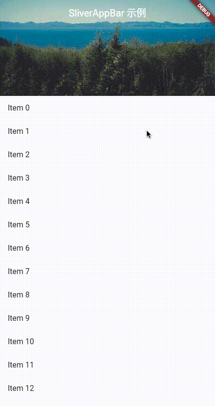
- 简单伸缩的
AppBar
Scaffold(
  body: CustomScrollView(
    slivers: [
      const SliverAppBar(
        title: Text('SliverAppBar 示例'),
        pinned: true,               // 折叠后保留标题栏
        expandedHeight: 200,        // 展开高度
        flexibleSpace: FlexibleSpaceBar(
          background: Image(
            image: NetworkImage(
                'https://picsum.photos/500/300?image=10'),
            fit: BoxFit.cover,
          ),
        ),
      ),
      SliverList(
        delegate: SliverChildBuilderDelegate(
          (_, index) => ListTile(title: Text('Item $index')),
          childCount: 50,
        ),
      ),
    ],
  ),
)
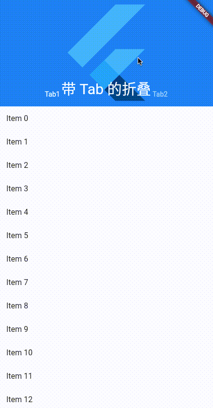
- 带
TabBar的折叠头部
DefaultTabController(
  length: 2,
  child: SliverAppBar(
    pinned: true,
    floating: true,
    snap: true,
    expandedHeight: 220,
    flexibleSpace: const FlexibleSpaceBar(
      title: Text('带 Tab 的折叠'),
      background: FlutterLogo(),
    ),
    bottom: const TabBar(
      tabs: [Tab(text: 'Tab1'), Tab(text: 'Tab2')],
    ),
  )
)
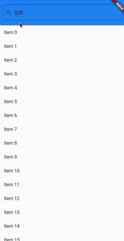
- 搜索框随滚动隐藏
SliverAppBar(
  expandedHeight: 90,
  pinned: false, // 不固定,随滚动完全滑走
  flexibleSpace: FlexibleSpaceBar(
    background: Align(
      alignment: Alignment.center,
      child: Padding(
        padding: const EdgeInsets.fromLTRB(12, 0, 12, 0),
        child: TextField(
          decoration: InputDecoration(
            hintText: '搜索...',
            prefixIcon: const Icon(Icons.search),
            border: OutlineInputBorder(
              borderRadius: BorderRadius.circular(8.0),
            ),
          )
        ),
      ),
    ),
  ),
)
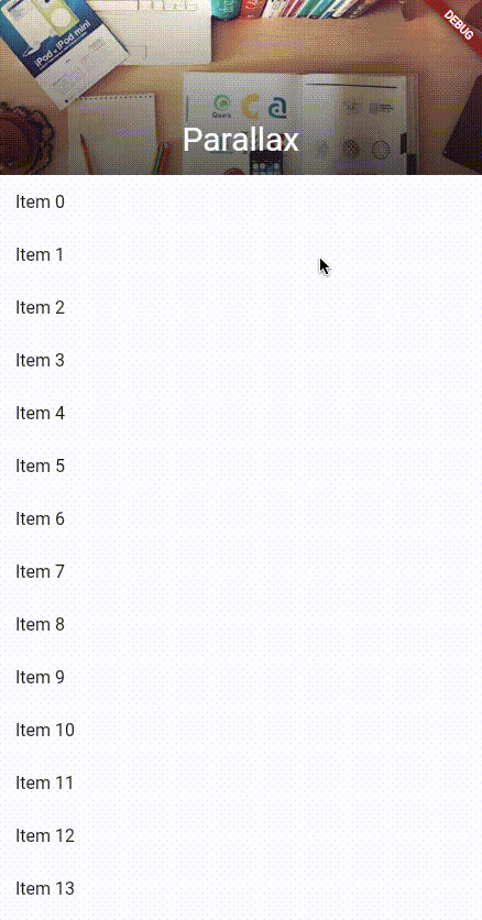
- 视差图片 + 渐变遮罩
flexibleSpace: FlexibleSpaceBar(
  title: const Text('Parallax'),
  background: Stack(
    fit: StackFit.expand,
    children: [
      Image.network('https://picsum.photos/600/400?image=20', fit: BoxFit.cover),
      DecoratedBox(
        decoration: BoxDecoration(
          gradient: LinearGradient(
            begin: Alignment.topCenter,
            end: Alignment.bottomCenter,
            colors: [Colors.transparent, Colors.black54],
          ),
        ),
      ),
    ],
  ),
)
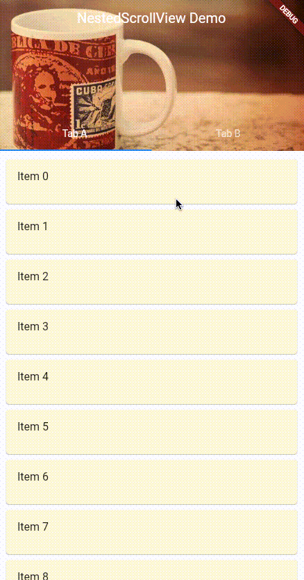
与NestedScrollView配合
当外层还有TabBarView时,用NestedScrollView把SliverAppBar和TabBar放在header,TabBarView放在body
import 'package:flutter/material.dart';
void main() {
runApp(MyApp());
}
class MyApp extends StatelessWidget {
Widget build(BuildContext context) {
return MaterialApp(
home: Scaffold(
body: DefaultTabController(
length: 2,
child: Scaffold(
body: NestedScrollView(
// 1. 头部区域(SliverAppBar + TabBar)
headerSliverBuilder: (context, innerBoxIsScrolled) => [
SliverOverlapAbsorber(
// 处理 TabBarView 与 SliverAppBar 的滚动重叠
handle:
NestedScrollView.sliverOverlapAbsorberHandleFor(context),
sliver: SliverAppBar(
title: const Text('NestedScrollView Demo'),
centerTitle: true,
// 折叠后仍保留标题栏
pinned: true,
// 下拉立即展开
floating: true,
snap: true,
// 展开高度(包含 flexibleSpace + TabBar)
expandedHeight: 220,
// 视差背景
flexibleSpace: FlexibleSpaceBar(
background: Image.network(
'https://picsum.photos/600/300?image=30',
fit: BoxFit.cover,
),
),
// 底部 TabBar
bottom: const TabBar(
tabs: [
Tab(text: 'Tab A'),
Tab(text: 'Tab B'),
],
),
),
),
],
// 2. 主体区域(TabBarView)
body: TabBarView(
children: [
// Tab A:用 CustomScrollView
_TabPage(
key: const PageStorageKey('TabA'),
itemCount: 30,
color: Colors.amber.shade50,
),
// Tab B:用 ListView
_TabPage(
key: const PageStorageKey('TabB'),
itemCount: 20,
color: Colors.blue.shade50,
),
],
),
),
),
),
)
);
}
}
class _TabPage extends StatelessWidget {
final int itemCount;
final Color color;
const _TabPage({
super.key,
required this.itemCount,
required this.color,
});
Widget build(BuildContext context) {
return SafeArea(
top: false, // 顶部由 SliverAppBar 处理
bottom: false,
child: Builder(
builder: (context) => CustomScrollView(
key: key,
slivers: [
// 让 TabBarView 的滚动与外层 NestedScrollView 同步
SliverOverlapInjector(
handle:
NestedScrollView.sliverOverlapAbsorberHandleFor(context),
),
// 实际内容
SliverPadding(
padding: const EdgeInsets.all(8),
sliver: SliverFixedExtentList(
itemExtent: 72,
delegate: SliverChildBuilderDelegate(
(_, index) => Card(
color: color,
child: ListTile(
title: Text('Item $index'),
),
),
childCount: itemCount,
),
),
),
],
),
),
);
}
}
总结
| 需求 | 推荐配置 |
|---|---|
| 普通折叠 | pinned: true |
| 下拉即展开 | floating: true |
| 完全展开/收起动画 | floating: true, snap: true |
| 带 TabBar | 配合 NestedScrollView |
| 视差背景 | FlexibleSpaceBar + Stack |
构造函数
SliverAppBar.new({Key? key, Widget? leading, bool automaticallyImplyLeading = true, Widget? title, List<Widget>? actions, Widget? flexibleSpace, PreferredSizeWidget? bottom, double? elevation, double? scrolledUnderElevation, Color? shadowColor, Color? surfaceTintColor, bool forceElevated = false, Color? backgroundColor, Color? foregroundColor, IconThemeData? iconTheme, IconThemeData? actionsIconTheme, bool primary = true, bool? centerTitle, bool excludeHeaderSemantics = false, double? titleSpacing, double? collapsedHeight, double? expandedHeight, bool floating = false, bool pinned = false, bool snap = false, bool stretch = false, double stretchTriggerOffset = 100.0, AsyncCallback? onStretchTrigger, ShapeBorder? shape, double toolbarHeight = kToolbarHeight, double? leadingWidth, TextStyle? toolbarTextStyle, TextStyle? titleTextStyle, SystemUiOverlayStyle? systemOverlayStyle, bool forceMaterialTransparency = false, bool useDefaultSemanticsOrder = true, Clip? clipBehavior, EdgeInsetsGeometry? actionsPadding})

SliverAppBar.large({Key? key, Widget? leading, bool automaticallyImplyLeading = true, Widget? title, List<Widget>? actions, Widget? flexibleSpace, PreferredSizeWidget? bottom, double? elevation, double? scrolledUnderElevation, Color? shadowColor, Color? surfaceTintColor, bool forceElevated = false, Color? backgroundColor, Color? foregroundColor, IconThemeData? iconTheme, IconThemeData? actionsIconTheme, bool primary = true, bool? centerTitle, bool excludeHeaderSemantics = false, double? titleSpacing, double? collapsedHeight, double? expandedHeight, bool floating = false, bool pinned = true, bool snap = false, bool stretch = false, double stretchTriggerOffset = 100.0, AsyncCallback? onStretchTrigger, ShapeBorder? shape, double toolbarHeight = _LargeScrollUnderFlexibleConfig.collapsedHeight, double? leadingWidth, TextStyle? toolbarTextStyle, TextStyle? titleTextStyle, SystemUiOverlayStyle? systemOverlayStyle, bool forceMaterialTransparency = false, bool useDefaultSemanticsOrder = true, Clip? clipBehavior, EdgeInsetsGeometry? actionsPadding})

SliverAppBar.medium({Key? key, Widget? leading, bool automaticallyImplyLeading = true, Widget? title, List<Widget>? actions, Widget? flexibleSpace, PreferredSizeWidget? bottom, double? elevation, double? scrolledUnderElevation, Color? shadowColor, Color? surfaceTintColor, bool forceElevated = false, Color? backgroundColor, Color? foregroundColor, IconThemeData? iconTheme, IconThemeData? actionsIconTheme, bool primary = true, bool? centerTitle, bool excludeHeaderSemantics = false, double? titleSpacing, double? collapsedHeight, double? expandedHeight, bool floating = false, bool pinned = true, bool snap = false, bool stretch = false, double stretchTriggerOffset = 100.0, AsyncCallback? onStretchTrigger, ShapeBorder? shape, double toolbarHeight = _MediumScrollUnderFlexibleConfig.collapsedHeight, double? leadingWidth, TextStyle? toolbarTextStyle, TextStyle? titleTextStyle, SystemUiOverlayStyle? systemOverlayStyle, bool forceMaterialTransparency = false, bool useDefaultSemanticsOrder = true, Clip? clipBehavior, EdgeInsetsGeometry? actionsPadding})
属性
外观控制
| 属性 | 类型 | 说明 | 默认值 | 示例 |
|---|---|---|---|---|
expandedHeight | double | 完全展开状态的高度(包含flexibleSpace) | - | expandedHeight: 240 |
flexibleSpace | Widget | 展开区域的内容(可滚动/视差效果) | - | flexibleSpace: FlexibleSpaceBar(...) |
backgroundColor | Color | 背景颜色 | 根据主题 | backgroundColor: Colors.blue |
title | Widget | 标题栏文字/组件(折叠后显示) | - | title: Text('首页') |
centerTitle | bool | 是否居中标题 | 根据平台 | centerTitle: true |
elevation | double | 折叠状态下的阴影高度 | 4.0 | elevation: 8.0 |
shadowColor | Color | 阴影颜色 | Colors.black | shadowColor: Colors.grey[400] |
surfaceTintColor | Color | Material 3 的表面色彩 | - | surfaceTintColor: Colors.blue |
forceElevated | bool | 强制始终显示阴影 | false | forceElevated: innerBoxIsScrolled |
primary | bool | 是否为应用栏(影响状态栏样式) | true | primary: true |
scrolledUnderElevation | double | 滚动到内容下方时的阴影高度 | - | scrolledUnderElevation: 4.0 |
定位方式
| 属性 | 类型 | 说明 | 默认值 | 示例 |
|---|---|---|---|---|
pinned | bool | 折叠后是否固定显示 | false | pinned: true |
floating | bool | 是否随下拉立即展开 | false | floating: true |
snap | bool | 是否自动完成展开/折叠动画(需配合floating) | false | snap: true |
stretch | bool | 是否支持拉伸效果 | false | stretch: true |
stretchTriggerOffset | double | 触发拉伸的滚动偏移量 | 100.0 | stretchTriggerOffset: 150.0 |
高级配置
| 属性 | 类型 | 说明 | 默认值 | 示例 |
|---|---|---|---|---|
bottom | PreferredSizeWidget | 底部组件(如TabBar) | - | bottom: TabBar(...) |
toolbarHeight | double | 折叠状态下工具栏高度 | kToolbarHeight | toolbarHeight: 64.0 |
collapsedHeight | double | 完全折叠时的高度 | toolbarHeight | collapsedHeight: 48.0 |
leading | Widget | 导航按钮(通常是返回键) | 返回按钮 | leading: IconButton(...) |
actions | List<Widget> | 操作按钮列表 | [] | actions: [IconButton(...)] |
automaticallyImplyLeading | bool | 是否自动显示返回按钮 | true | automaticallyImplyLeading: false |
floatingHeight | double | floating=true时的最小显示高度 | toolbarHeight | floatingHeight: 56.0 |
excludeHeaderSemantics | bool | 是否排除标题语义信息 | false | excludeHeaderSemantics: true |
titleSpacing | double | 标题与边缘的间距 | NavigationToolbar.kMiddleSpacing | titleSpacing: 4.0 |
shape | ShapeBorder | AppBar的形状 | - | shape: RoundedRectangleBorder(...) |
notificationPredicate | ScrollNotificationPredicate | 自定义滚动通知过滤规则 | defaultScrollNotificationPredicate | 自定义条件 |
NestedScrollView特定属性
| 属性 | 类型 | 说明 | 默认值 | 示例 |
|---|---|---|---|---|
floating | bool | 是否随下拉立即展开 | false | floating: true |
snap | bool | 是否自动完成展开/折叠 | false | snap: true |
pinned | bool | 折叠后是否固定显示 | false | pinned: true |