Placeholder
一个代表将来有一天会添加其他组件用于占位的组件
这个组件在开发时期很有用,用于代表页面还没有开发完成。
默认情况下,Placeholder将会调整自身大小来填充满它的容器。如果外部没有大小约束限制,它会通过fallbackWidth和fallbackHeight来调整自身大小。
示例
import 'package:flutter/material.dart';
void main() => runApp(const MyApp());
class MyApp extends StatelessWidget {
const MyApp({super.key});
Widget build(BuildContext context) {
return MaterialApp(
title: 'Placeholder 示例',
theme: ThemeData(useMaterial3: true, colorSchemeSeed: Colors.indigo),
home: const PlaceholderDemo(),
);
}
}
class PlaceholderDemo extends StatelessWidget {
const PlaceholderDemo({super.key});
Widget build(BuildContext context) {
return Scaffold(
appBar: AppBar(title: const Text('Placeholder 示例')),
body: ListView(
padding: const EdgeInsets.all(16),
children: const [
// 1. 默认 Placeholder(占满父级)
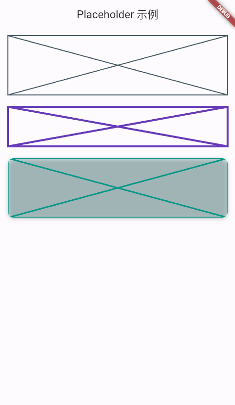
SizedBox(
height: 120,
child: Placeholder(), // 默认灰色十字,占满 120 高
),
SizedBox(height: 24),
// 2. 自定义颜色、线宽、尺寸
SizedBox(
width: 160,
height: 80,
child: Placeholder(
color: Colors.deepPurple,
strokeWidth: 4,
fallbackWidth: 160,
fallbackHeight: 80,
),
),
SizedBox(height: 24),
// 3. 圆角阴影风格的 Placeholder
RoundedPlaceholder(
width: 200,
height: 120,
cornerRadius: 12,
color: Colors.teal,
strokeWidth: 3,
),
],
),
);
}
}
/// 带圆角阴影的 Placeholder 封装
class RoundedPlaceholder extends StatelessWidget {
const RoundedPlaceholder({
super.key,
required this.width,
required this.height,
this.cornerRadius = 8,
this.color = Colors.blueGrey,
this.strokeWidth = 2,
});
final double width;
final double height;
final double cornerRadius;
final Color color;
final double strokeWidth;
Widget build(BuildContext context) {
return SizedBox(
width: width,
height: height,
child: DecoratedBox(
decoration: BoxDecoration(
borderRadius: BorderRadius.circular(cornerRadius),
color: color.withOpacity(0.15),
boxShadow: const [
BoxShadow(
blurRadius: 6,
offset: Offset(0, 2),
color: Colors.black26,
),
],
),
child: ClipRRect(
borderRadius: BorderRadius.circular(cornerRadius),
child: Placeholder(
color: color,
strokeWidth: strokeWidth,
fallbackWidth: width,
fallbackHeight: height,
),
),
),
);
}
}
构造函数
Placeholder.new({
  Key? key,
  Color color = const Color(0xFF455A64),
  double strokeWidth = 2.0,
  double fallbackWidth = 400.0,
  double fallbackHeight = 400.0,
  Widget? child
})
属性
| 参数名 | 参数类型 | 说明 |
|---|---|---|
| child | Widget? | Placeholder子组件 |
| color | Color | Placeholder颜色 |
| fallbackHeight | double | 当没有外部高度约束时,使用的高度 |
| fallbackWidth | double | 但没有外部宽度约束时,使用的宽度 |
| strokeWidth | double | Placeholder线条宽度 |