CupertinoDesktopTextSelectionToolbar
用于桌面端(如macOS、Windows)的文本选择工具栏组件,遵循Cupertino设计语言(iOS 风格)
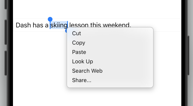
CupertinoDesktopTextSelectionToolbar是Flutter中用于桌面端(如macOS、Windows)的文本选择工具栏组件,遵循Cupertino设计语言(iOS风格)。它通常在用户选中文本时自动弹出,提供剪切、复
制、粘贴等操作按钮。与移动端不同,桌面端的工具栏支持鼠标交互和快捷键适配,并具有更灵活的定位逻辑。
核心逻辑
- 当文本被选中时,工具栏通过
Overlay显示在选区附近。 - 工具栏按钮响应桌面端手势(如鼠标悬停)和键盘快捷键(如
Ctrl+C)。 - 组件自动适配暗黑模式,并支持自定义按钮和样式。
使用场景
- 文本编辑器: 在桌面应用中处理文本选择操作(如笔记应用、代码编辑器)。
- 表单输入框: 为
TextField或TextFormField提供原生风格的文本操作菜单。 - 自定义工具栏: 扩展默认按钮(如添加“翻译”或“分享”按钮)。
示例
基础文本选择工具栏
import 'package:flutter/cupertino.dart';
import 'package:flutter/material.dart';
class BasicTextSelectionDemo extends StatelessWidget {
Widget build(BuildContext context) {
return CupertinoApp(
home: CupertinoPageScaffold(
child: Center(
child: SizedBox(
width: 300,
child: TextField(
toolbarOptions: ToolbarOptions(
copy: true,
cut: true,
paste: true,
selectAll: true,
),
onTap: () {
// 工具栏通常在文本选中时自动触发,此处无需额外逻辑
},
),
),
),
),
);
}
}
自定义工具栏按钮与样式
import 'package:flutter/cupertino.dart';
class CustomToolbarDemo extends StatelessWidget {
Widget build(BuildContext context) {
return CupertinoApp(
home: CupertinoPageScaffold(
child: Center(
child: CupertinoTextField(
toolbarOptions: ToolbarOptions(
copy: true,
cut: true,
paste: true,
),
contextMenuBuilder: (context, editableTextState) {
return CupertinoDesktopTextSelectionToolbar(
anchor: editableTextState.contextMenuAnchors.primary,
children: [
// 默认按钮
CupertinoDesktopTextSelectionToolbarButton.button(
onPressed: () => editableTextState.cut(),
child: Text('剪切'),
),
CupertinoDesktopTextSelectionToolbarButton.button(
onPressed: () => editableTextState.copy(),
child: Text('复制'),
),
// 自定义按钮
CupertinoDesktopTextSelectionToolbarButton.button(
onPressed: () => print('自定义操作'),
child: Text('翻译'),
),
],
);
},
),
),
),
);
}
}
手动控制工具栏的显示与隐藏
import 'package:flutter/cupertino.dart';
import 'package:flutter/rendering.dart';
class ManualToolbarDemo extends StatefulWidget {
_ManualToolbarDemoState createState() => _ManualToolbarDemoState();
}
class _ManualToolbarDemoState extends State<ManualToolbarDemo> {
final GlobalKey _textKey = GlobalKey();
OverlayEntry? _toolbarEntry;
void _showToolbar() {
final renderBox = _textKey.currentContext?.findRenderObject() as RenderBox;
final offset = renderBox.localToGlobal(Offset.zero);
_toolbarEntry = OverlayEntry(
builder: (context) => Positioned(
left: offset.dx,
top: offset.dy,
child: CupertinoDesktopTextSelectionToolbar(
anchor: offset,
children: [
CupertinoDesktopTextSelectionToolbarButton.button(
onPressed: () => print('自定义操作'),
child: Text('按钮1'),
),
],
),
),
);
Overlay.of(context).insert(_toolbarEntry!);
}
void _hideToolbar() {
_toolbarEntry?.remove();
_toolbarEntry = null;
}
Widget build(BuildContext context) {
return CupertinoApp(
home: CupertinoPageScaffold(
child: Column(
children: [
TextField(key: _textKey),
CupertinoButton(
onPressed: _showToolbar,
child: Text('显示工具栏'),
),
CupertinoButton(
onPressed: _hideToolbar,
child: Text('隐藏工具栏'),
),
],
),
),
);
}
}
注意点
常见问题与优化
- 性能瓶颈:
- 避免在
contextMenuBuilder中构建复杂组件,否则可能导致弹出延迟。 - 推荐使用
const修饰静态按钮组件以减少重建开销。
- 兼容性警告:
- 该组件仅适用于桌面端(macOS/Windows/Linux)。在移动端需使用
CupertinoTextSelectionToolbar。 - 确保Flutter版本≥3.7.0(组件稳定性依赖版本)。
- 定位异常:
- 如果工具栏偏移不准,检查
anchor参数是否来源于正确的BuildContext。 - 在可滚动视图内使用时,需通过
RenderObject动态计算位置。
最佳实践
- 快捷键集成: 为按钮添加键盘快捷键(如
CutSelectionIntent)以提升桌面体验。 - 暗黑模式适配: 依赖
Cupertino主题自动切换,无需手动处理颜色。 - 无障碍支持: 为按钮添加
tooltip属性,方便屏幕阅读器识别。
构造函数
const CupertinoDesktopTextSelectionToolbar({
  Key? key,
  required Offset anchor,
  required List<CupertinoDesktopTextSelectionToolbarButton> children,
})
属性
| 属性名 | 属性类型 | 说明 |
|---|---|---|
anchor | Offset | 控制工具栏显示位置的锚点坐标(需转换为全局坐标)。 |
children | List<CupertinoDesktopTextSelectionToolbarButton> | 工具栏的子组件,通常为按钮集合。 |
关键属性详解
anchor: 必须通过RenderBox.localToGlobal计算获取,确保工具栏准确定位到文本选区。错误的位置会导致工具栏漂浮或偏移。children: 仅接受CupertinoDesktopTextSelectionToolbarButton类型的按钮。自定义按钮需遵循以下格式:
CupertinoDesktopTextSelectionToolbarButton.button(
  onPressed: () { /* 操作逻辑 */ },
  child: Text('按钮标签'),
)