CupertinoListSection
Cupertino设计语言中的列表分区组件,用于创建iOS风格的分组列表界面
CupertinoListSection是Flutter Cupertino设计语言中的列表分区组件,用于创建iOS风格的分组列表界面。其核心逻辑是将多个列表项(CupertinoListTile)组织成视觉上独立的区块,通过背景色、内边距和分割线增强
内容的结构化层次。该组件遵循iOS的Human Interface Guidelines,提供与原生iOS设置界面一致的交互体验。
使用场景
- 设置页面: 如系统设置中的网络、通知等分组选项。
- 数据分类展示: 例如用户资料页的信息分组(基本信息、隐私设置)。
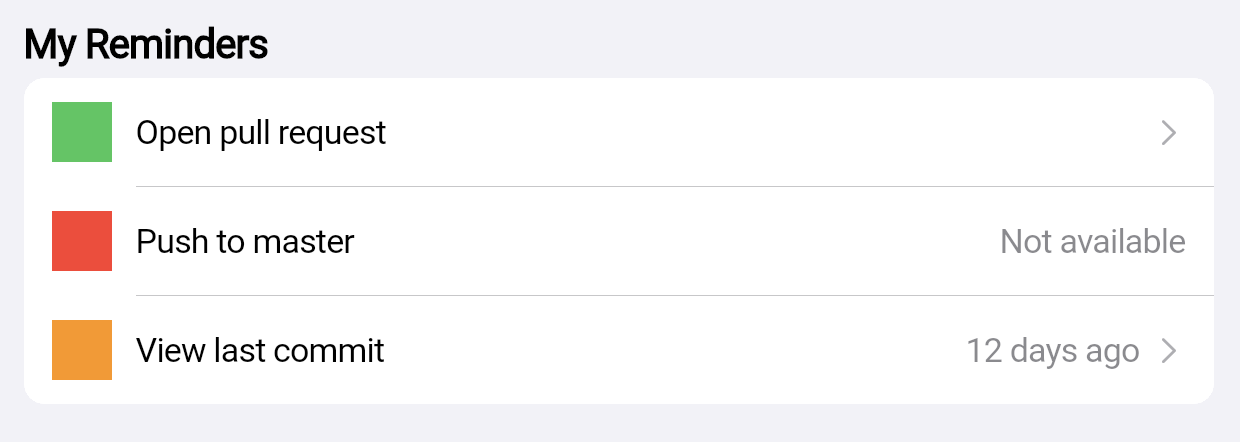
- 表单分组: 将相关输入项(如收货地址的省市区)聚合在同一区块。
示例
基础设置列表
CupertinoListSection(
  header: Text('账户设置'),
  children: [
    CupertinoListTile(
      title: Text('修改密码'),
      onTap: () => print('跳转密码修改页'),
    ),
    CupertinoListTile(
      title: Text('绑定手机'),
      additionalInfo: Text('未绑定'),
      onTap: () => print('跳转手机绑定页'),
    ),
  ],
)
带交互状态的动态列表
bool isNotifyEnabled = true;

CupertinoListSection(
  header: Text('通知管理'),
  footer: Text('开启后接收应用推送'),
  children: [
    CupertinoListTile(
      title: Text('消息提醒'),
      trailing: CupertinoSwitch(
        value: isNotifyEnabled,
        onChanged: (v) => setState(() => isNotifyEnabled = v),
      ),
    ),
    if (!isNotifyEnabled) // 动态控制子项显示
      CupertinoListTile(
        title: Text('免打扰时段'),
        onTap: () => showPickerDialog(),
      ),
  ],
)
适配深色主题的列表
CupertinoListSection(
  backgroundColor: CupertinoColors.systemBackground, // 自动适应深色/浅色主题
  dividerMargin: 20, // 调整分割边距
  children: [
    CupertinoListTile.notched(
      title: Text('隐私政策'),
      leading: Icon(CupertinoIcons.lock, size: 20),
    ),
    CupertinoListTile.notched(
      title: Text('用户协议'),
      leading: Icon(CupertinoIcons.doc_text, size: 20),
    ),
  ],
)
注意点
- 性能瓶颈
- 避免在
children中直接放置过多复杂子组件(如嵌套列表),应使用ListView.builder懒加载。 - 若需动态数据,建议将
CupertinoListSection作为ListView的item以支持滚动优化。
- 兼容性警告
- 该组件严格遵循iOS设计规范,在Android平台可能产生风格不一致性,需通过
ThemeData.platform切换主题适配。
- 优化技巧
- 使用
CupertinoListTile.notched替代默认样式可消除列表项左侧空白,提升空间利用率。 - 通过
dividerMargin控制分割线与内容的间距,避免在紧凑布局中显得拥挤。
构造函数
CupertinoListSection({
  Key? key,
  Widget? header,          // 分区顶部标题组件(如Text)
  Widget? footer,          // 分区底部说明组件
  List<Widget> children = const [],  // 子项列表(通常为CupertinoListTile)
  Color? backgroundColor,  // 分区背景色(默认适配主题)
  double dividerMargin = 0.0, // 分割线边距(单位:逻辑像素)
})
属性
| 属性名 | 类型 | 说明 |
|---|---|---|
header | Widget? | 分区顶部标题,通常为 Text 组件 |
footer | Widget? | 分区底部说明文本 |
children | List<Widget> | 子项列表,需为 CupertinoListTile 或其变体 |
backgroundColor | Color? | 背景色(默认使用 CupertinoColors.systemBackground) |
dividerMargin | double | 分割线左右边距(默认 0.0,表示占满宽度) |
关键属性详解
children: 必须包含CupertinoListTile组件,若混入其他组件(如按钮)会破坏iOS风格一致性。dividerMargin: 通过调整该值可实现自定义缩进效果,例如设为20.0可使分割线与内容对齐而非贴边。backgroundColor: 若未指定,组件会自动响应系统深色/浅色主题切换,无需手动处理颜色逻辑。