ElevatedButton
一个Material Design设计的凸起按钮
使用ElevatedButton为原本较为扁平的布局增加层次感,例如在冗长密集的内容列表或者宽阔的空间中使用。避免在已经有凸起效果的组件上(如对话框或卡片)使用ElevatedButton。
ElevatedButton就是一个包裹了Material组件的Label组件,当按钮被按下的时候,外部的Material组件的elevation值会增加。Label的文字和图标样式由ButtonStyle.foregroundColor控制,外部按钮将会由ButtonStyle.backgroundColor填充。
ElevatedButton的默认样式由defaultStyleOf定义。可以通过其style参数设置来覆盖默认样式设置。在同一个组件树中的所有ElevatedButton可以通过设置ElevatedButtonTheme来全部覆盖,整个APP中的ElevatedButton的样式可以通过Theme的ThemeData.elevatedButtonTheme属性来覆盖。
ElevatedButon有一个静态方法styleFrom可以快捷创建使用自定义样式的ElevatedButton。
如果没有设置onPressed和onLongPress回调,那么按钮将自动被设置为disabled。
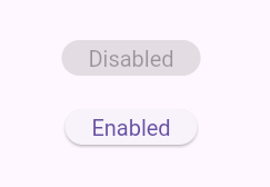
示例
Widget build(BuildContext context) {
final ButtonStyle style = ElevatedButton.styleFrom(textStyle: const TextStyle(fontSize: 20));
return Center(
child: Column(
mainAxisSize: MainAxisSize.min,
children: <Widget>[
ElevatedButton(style: style, onPressed: null, child: const Text('Disabled')),
const SizedBox(height: 30),
ElevatedButton(style: style, onPressed: () {}, child: const Text('Enabled')),
],
),
);
}
构造函数
默认构造函数
ElevatedButton.new({
  Key? key,
  required VoidCallback? onPressed,
  VoidCallback? onLongPress,
  ValueChanged<bool>? onHover,
  ValueChanged<bool>? onFocusChange,
  ButtonStyle? style,
  FocusNode? focusNode,
  bool autofocus = false,
  Clip? clipBehavior,
  MaterialStatesController? statesController,
  required Widget? child
})
创建一个带icon的ElevatedButton
ElevatedButton.icon({
  Key? key,
  required VoidCallback? onPressed,
  VoidCallback? onLongPress,
  ValueChanged<bool>? onHover,
  ValueChanged<bool>? onFocusChange,
  ButtonStyle? style,
  FocusNode? focusNode,
  bool? autofocus,
  Clip? clipBehavior,
  MaterialStatesController? statesController,
  Widget? icon,
  required Widget label,
  IconAlignment? iconAlignment
})
属性
| 属性名 | 属性类型 | 说明 |
|---|---|---|
| autofocus | bool | 在范围内没有其他组件设置为focused的情况下,该属性设置为true时,将会自动focused |
| child | Widget? | 设置按钮的child,通常情况是label文本组件 |
| clipBehavior | Clip? | 根据配置来决定是否进行裁切 |
| enabled | bool | 控制按钮是否是可用 |
| onFoucsChange | ValueChanged<bool>? | 焦点变更时的回调 |
| onHover | ValueChanged<bool>? | 悬浮在按钮上时触发的回调 |
| onLongPress | VoidCallback? | 长按按钮触发的回调 |
| onPressed | VoidCallback? | 点击按钮时触发的回调 |
| statesController | MaterialStatesController? | 表示此Widget的交互状态,通过一组WidgetStates来定义,比如WidgetState.pressed和WidgetState.focused |
| style | ButtonStyle? | 自定义按钮的外观 |
| tooltip | String? | 用于描述当按钮被按下或者悬浮时将要发生的行为的文字 |
方法
| 方法名 | 方法类型 | 说明 |
|---|---|---|
| defaultStyleOf | (BuildContext context) -> ButtonStyle | 定义按钮的默认外观 |
| themeStyleOf | (BuildContext context) -> ButtonStyle? | 返回最近的ElevatedButtonTheme祖先的ElevatedButtonThemeData.style |
静态方法
通过设定简单的按钮样式就可以方便地创建一个ElevatedButton
styleFrom({
  Color? foregroundColor,
  Color? backgroundColor,
  Color? disabledForegroundColor,
  Color? disabledBackgroundColor,
  Color? shadowColor,
  Color? surfaceTintColor,
  Color? iconColor,
  double? iconSize,
  IconAlignment? iconAlignment,
  Color? disabledIconColor,
  Color? overlayColor,
  double? elevation,
  TextStyle? textStyle,
  EdgeInsetsGeometry? padding,
  Size? minimumSize,
  Size? fixedSize,
  Size? maximumSize,
  BorderSide? side,
  OutlinedBorder? shape,
  MouseCursor? enabledMouseCursor,
  MouseCursor? disabledMouseCursor,
  VisualDensity? visualDensity,
  MaterialTapTargetSize? tapTargetSize,
  Duration? animationDuration,
  bool? enableFeedback,
  AlignmentGeometry? alignment,
  InteractiveInkFeatureFactory? splashFactory,
  ButtonLayerBuilder? backgroundBuilder,
  ButtonLayerBuilder? foregroundBuilder
}) -> ButtonStyle