NavigationDrawer
实现Material Design风格侧边导航抽屉的组件
NavigationDrawer是Flutter中用于实现Material Design风格侧边导航抽屉的组件。它通常从屏幕左侧滑出(在RTL语言环境下从右侧滑出),提供应用的主要导航选项。其核心逻
辑基于Scaffold.drawer属性集成,通过手势滑动或按钮触发显示/隐藏。主要用途包括:
- 作为应用主导航菜单,包含页面切换、设置入口等。
- 在有限屏幕空间下优化导航结构,保持界面整洁。
- 支持自定义头部(如用户信息)和尾部内容(如退出按钮)。
典型使用场景
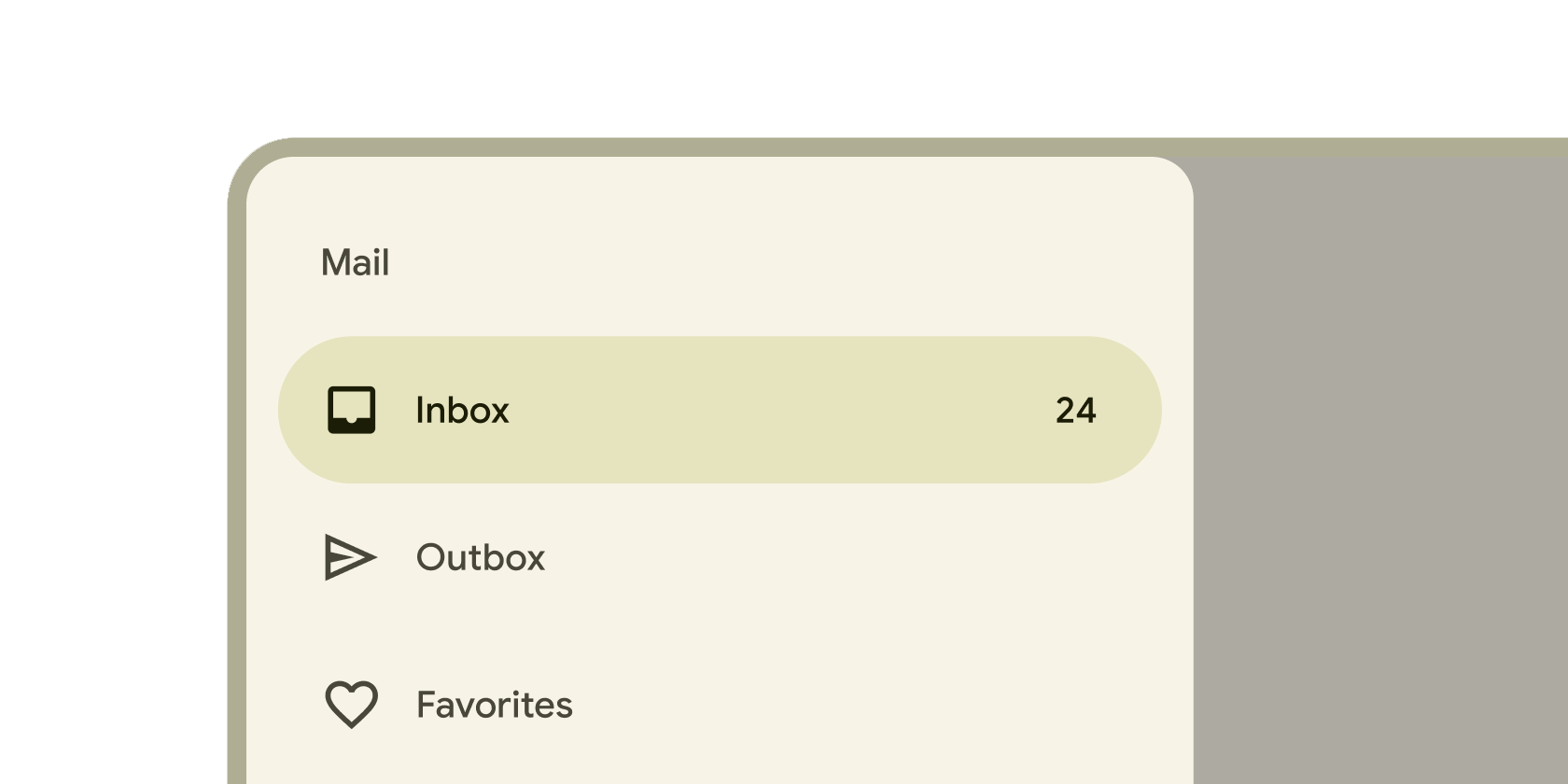
- 移动应用的主导航菜单(如邮箱应用中的文件夹列表)。
- 设置面板或功能列表的隐藏式访问。
- 配合
AppBar的leading图标(如汉堡菜单)触发显示。
示例
基础导航抽屉
import 'package:flutter/material.dart';
void main() => runApp(const MyApp());
class MyApp extends StatelessWidget {
const MyApp({super.key});
Widget build(BuildContext context) {
return MaterialApp(
home: Scaffold(
appBar: AppBar(title: const Text('基础抽屉示例')),
drawer: NavigationDrawer(
children: [
// 抽屉头部
const DrawerHeader(
decoration: BoxDecoration(color: Colors.blue),
child: Text('导航菜单', style: TextStyle(color: Colors.white)),
),
// 导航项
NavigationDrawerDestination(
icon: Icon(Icons.home),
label: Text('首页'),
),
NavigationDrawerDestination(
icon: Icon(Icons.settings),
label: Text('设置'),
),
],
),
body: const Center(child: Text('主内容区')),
),
);
}
}
带交互逻辑的抽屉
// 在 StatefulWidget 中管理当前选中项
class InteractiveDrawerExample extends StatefulWidget {
const InteractiveDrawerExample({super.key});
State<InteractiveDrawerExample> createState() => _InteractiveDrawerExampleState();
}
class _InteractiveDrawerExampleState extends State<InteractiveDrawerExample> {
int _selectedIndex = 0;
void _onItemTapped(int index) {
setState(() => _selectedIndex = index);
Navigator.pop(context); // 选择后关闭抽屉
}
Widget build(BuildContext context) {
return Scaffold(
appBar: AppBar(title: const Text('交互式抽屉')),
drawer: NavigationDrawer(
selectedIndex: _selectedIndex,
onDestinationSelected: _onItemTapped,
children: const [
DrawerHeader(child: Text('选择页面')),
NavigationDrawerDestination(icon: Icon(Icons.chat), label: Text('聊天')),
NavigationDrawerDestination(icon: Icon(Icons.group), label: Text('联系人')),
],
),
body: IndexedStack(
index: _selectedIndex,
children: [ChatPage(), ContactsPage()], // 自定义页面组件
),
);
}
}
适配暗色主题的抽屉
// 在 ThemeData 中统一配置抽屉样式
MaterialApp(
  theme: ThemeData(
    useMaterial3: true,
    navigationDrawerTheme: NavigationDrawerThemeData(
      backgroundColor: Colors.grey[900],
      indicatorColor: Colors.blueAccent,
      labelTextStyle: MaterialStateProperty.all(
        TextStyle(color: Colors.white, fontWeight: FontWeight.bold),
      ),
    ),
  ),
  home: Scaffold(
    drawer: NavigationDrawer(
      children: [
        DrawerHeader(
          decoration: BoxDecoration(color: Colors.blue[800]),
          child: Text('暗色主题抽屉', style: TextStyle(color: Colors.white)),
        ),
        NavigationDrawerDestination(icon: Icon(Icons.nightlight), label: Text('夜间模式')),
      ],
    ),
  ),
);
注意点
常见问题与解决方案
- 性能瓶颈: 避免在抽屉中加载大量动态内容(如长列表),可使用
ListView.builder延迟构建。 - 手势冲突: 在抽屉展开时,底层内容可能仍响应手势,可通过
DrawerController精确控制状态。 - 键盘遮挡: 在包含输入框的抽屉中,需用
Scaffold.resizeToAvoidBottomInset调整布局。
优化技巧
- 为高频使用项添加快捷键支持(如物理返回键关闭抽屉)。
- 使用
NavigationDrawer的indicatorColor属性强化当前选中状态。 - 在宽屏设备上考虑永久性抽屉模式(通过
Scaffold.endDrawer实现右侧抽屉)。
最佳实践
- 保持导航项数量合理(建议不超过7个),过多时分组显示。
- 抽屉内容应与
AppBar标题联动,确保导航一致性。 - 测试抽屉在
RTL(从右到左)语言环境下的布局适配。
构造函数
NavigationDrawer({
  Key? key,
  Widget? header, // 自定义头部组件(替代旧版 DrawerHeader)
  List<Widget> children = const [], // 抽屉内容列表
  int? selectedIndex, // 当前选中项的索引
  ValueChanged<int>? onDestinationSelected, // 选项选中回调
  double? elevation, // 阴影高度
  Color? shadowColor, // 阴影颜色
  Color? surfaceTintColor, // 表面色调(Material 3)
  Color? backgroundColor, // 背景色
  Color? indicatorColor, // 选中指示器颜色
  // 其他样式控制属性...
})
属性
| 属性名 | 类型 | 说明 |
|---|---|---|
children | List<Widget> | 抽屉内容组件列表,通常包含 NavigationDrawerDestination 或分隔符 Divider。 |
selectedIndex | int? | 当前选中导航项的索引,用于高亮显示(需与 onDestinationSelected 配合)。 |
onDestinationSelected | ValueChanged<int>? | 当用户选择导航项时触发的回调,接收索引参数。 |
backgroundColor | Color? | 抽屉背景颜色,默认使用 ThemeData.drawerBackgroundColor。 |
indicatorColor | Color? | 选中项的高亮指示器颜色,默认使用 ThemeData.indicatorColor。 |
elevation | double? | 抽屉的阴影高度,影响视觉层次感(Material Design 规范)。 |
surfaceTintColor | Color? | Material 3 风格的表面对比色,用于增强背景色调。 |
关键属性解析:
selectedIndex与onDestinationSelected: 这两个属性共同实现交互式导航。当用户点击项时,onDestinationSelected返回索引,需在父组件中更新selectedIndex以刷新选中状态(如示例 2)。若未设置,抽屉仅作为静态菜单。indicatorColor: 在Material 3设计语言中,该属性控制选中项的视觉标识(如圆角矩形背景色)。通过ThemeData统一配置可确保与应用主题一致。backgroundColor: 覆盖默认背景色时需考虑对比度,确保文字内容可读性(尤其在暗色主题下)。