ListTile
用于在列表中构建标准化的行布局
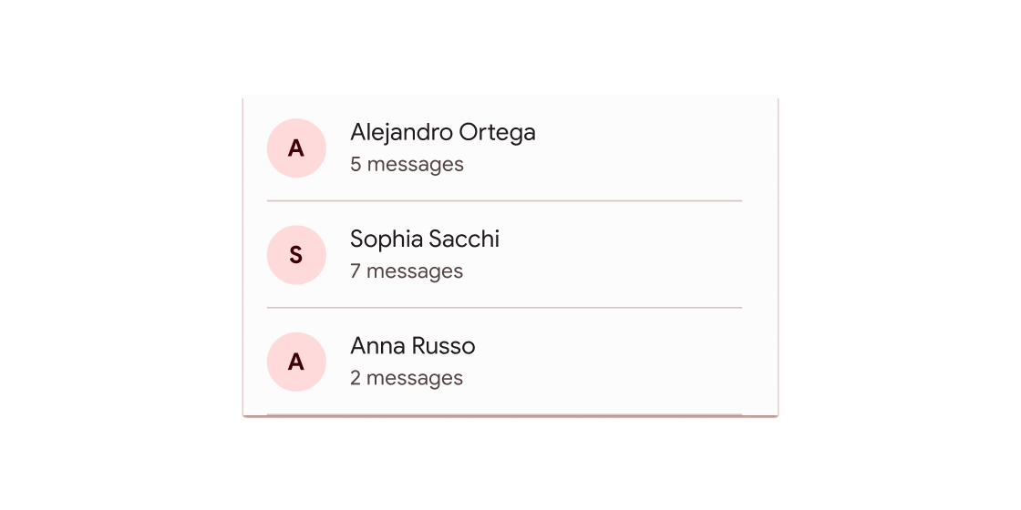
ListTile是Flutter中一个常用的列表项组件,主要用于在列表(如ListView)中构建标准化的行布局。它封装了常见的列表元素结构,如标题、副标题、前导图标、尾随图标等,简化了列表项的UI设计。其核心逻辑是通过预定义的布
局模板,确保列表项在不同平台(Android/iOS)上保持一致的视觉风格和交互体验(如点击涟漪效果)。
典型应用场景
- 设置页面中的选项列表(如“账户”、“通知”)。
- 聊天列表的消息项(显示头像、用户名、最后消息)。
- 文件管理器中的文件项(图标、文件名、详情)。
示例
基础列表项
ListView(
  children: [
    ListTile(
      leading: Icon(Icons.settings), // 前导图标
      title: Text("账户设置"),         // 主标题
      onTap: () => print("跳转到账户页面"), // 点击交互
    ),
    ListTile(
      leading: Icon(Icons.notifications),
      title: Text("消息通知"),
      subtitle: Text("管理通知权限"),    // 副标题
      trailing: Icon(Icons.arrow_forward), // 尾随图标
    ),
  ],
)
带交互的复杂列表
ListTile(
  leading: CircleAvatar(backgroundImage: NetworkImage("头像URL")), // 圆形头像
  title: Text("用户名"),
  subtitle: Text("最后一条消息..."),
  trailing: Text("12:30", style: TextStyle(color: Colors.grey)),
  onTap: () => Navigator.push(context, MaterialPageRoute(builder: (_) => ChatPage())),
  dense: true, // 紧凑模式,减少高度
)
适配主题的列表项
ListTile(
  title: Text("主题切换"),
  trailing: Switch( // 尾随开关组件
    value: isDarkMode,
    onChanged: (v) => setState(() => isDarkMode = v),
  ),
  tileColor: isDarkMode ? Colors.grey[800] : Colors.white, // 动态背景色
  textColor: isDarkMode ? Colors.white : Colors.black,
)
注意点
- 性能优化:
- 在长列表中避免直接使用
ListView(children: [ListTile(...)]),应改用ListView.builder按需构建项,防止内存溢出。 - 若列表项高度固定,显式设置
ListView的itemExtent属性可提升滚动性能。
- 兼容性与适配:
ListTile默认高度适应内容,但通过dense: true可切换为紧凑模式(减少垂直间距)。- 在
Cupertino风格应用中,需额外包裹CupertinoListTile以实现iOS风格。
- 交互设计:
- 若需禁用点击效果,设置
onTap: null即可(外观会变为灰色不可用状态)。 - 通过
enabled: false可完全禁用列表项,包括文字颜色变灰。
构造函数
ListTile({
  Key? key,
  this.leading,          // 前导部件(通常为 Icon 或 CircleAvatar)
  this.title,             // 主标题(必须为非空 Text)
  this.subtitle,          // 副标题(可选 Text)
  this.trailing,          // 尾随部件(如 Icon、Switch)
  this.isThreeLine = false, // 是否支持三行布局(需 subtitle 非空)
  this.dense = false,     // 紧凑模式
  this.visualDensity,     // 视觉密度调整
  this.shape,             // 自定义形状(如圆角边框)
  this.style,             // 主题样式(ListTileStyle)
  this.selectedColor,     // 选中状态颜色
  this.iconColor,         // 图标颜色
  this.textColor,         // 文字颜色
  this.contentPadding,    // 内边距
  this.enabled = true,    // 是否启用
  this.onTap,             // 点击回调
  this.onLongPress,       // 长按回调
  this.mouseCursor,       // 鼠标悬停样式
  this.selected = false,   // 是否选中
  this.focusNode,         // 焦点控制
  this.autofocus = false, // 自动聚焦
  this.tileColor,         // 背景色
  this.selectedTileColor, // 选中时的背景色
  this.horizontalTitleGap, // 标题与前导图间的水平间距
})
属性
| 属性名 | 属性类型 | 说明 |
|---|---|---|
leading | Widget? | 列表项前部显示的组件(如图标) |
title | Widget? | 必需的主标题组件(通常为 Text) |
subtitle | Widget? | 副标题组件(支持多行文本) |
trailing | Widget? | 列表项尾部组件(如箭头、开关) |
isThreeLine | bool | 是否为三行布局(需 subtitle 非空) |
dense | bool | 紧凑模式(减少垂直间距) |
onTap | VoidCallback? | 点击事件的回调函数 |
selected | bool | 选中状态(影响颜色样式) |
tileColor | Color? | 自定义背景色 |
selectedTileColor | Color? | 选中时的背景色 |
关键属性解析
title: 必须提供的属性,用于显示核心信息。若未设置,ListTile将无法正常渲染。dense: 在需要显示大量列表项时(如设置页面),设置为true可节省空间,提升信息密度。onTap: 交互核心属性。若需实现页面跳转或状态更新,必须在此回调中处理逻辑。selected与颜色属性: 通过组合selected、tileColor和selectedTileColor,可轻松实现高亮选中的效果(常见于标签选择或导航菜单)。